Android Automotive enhances safety with heads-up navigation display
Key Points:
- Quick Info: Distance, time, and arrival data are now shown directly in the dashboard.
- Safety Boost: Keeps essential navigation details within easy view while driving.
- Convenience: Allows other apps to stay open without losing navigation details.
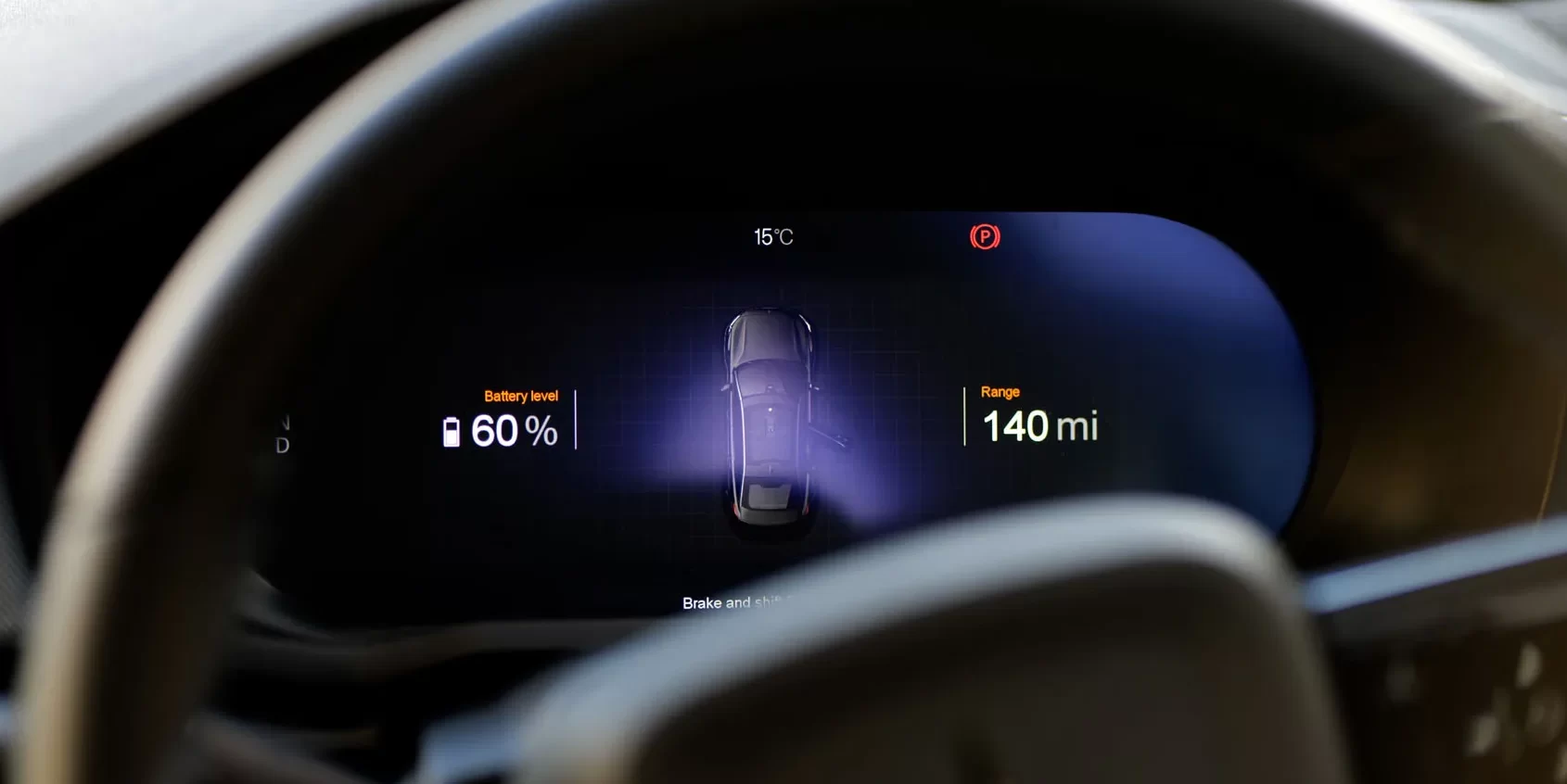
Android Automotive has introduced a new feature that enhances driving safety and convenience. The latest update adds a heads-up mini display that shows essential travel information, such as distance, travel time, and estimated arrival time, directly on the dashboard when using Google Maps for navigation.
This new display feature has begun rolling out for Google Maps and is already visible on vehicles like the Polestar 2 with the latest Android Automotive P3.1.10 build. Previously, this information was confined to the center console, but now it appears as a small block on the dashboard when you start navigation. The block shows the estimated travel time, distance in miles or kilometers, and expected arrival time, all based on your current speed.
While this heads-up panel improves accessibility, it might slightly cover some map directions while you’re driving. However, once you reach your destination or cancel the navigation, the mini-panel disappears, reverting to the basic Maps overview or the default Android Automotive dashboard.
Updates to Android Automotive tend to be gradual, but even small changes like this can significantly improve the driving experience. This feature is particularly beneficial as it reduces the need to glance away from the road, keeping key navigation information in your line of sight. It’s a thoughtful addition that enhances safety by minimizing distractions.
Moreover, this update is a time-saver. Drivers no longer need to reopen the Maps app on the center console to check travel details. They can keep other apps, such as music or media, open without losing track of essential navigation information.
Google Home: A glimpse into the future of smart living
The Google Home app has become the central nervous system of our smart homes, orchestrating everything from lighting and temperature to security and entertainment. While many updates focus on expanding device compatibility, a deeper look reveals a significant shift towards intelligent automation and user-friendly design. Recent developments within a test version of the Google Home app (version 3.29) offer a compelling preview of what’s to come, hinting at a more intuitive and proactive smart home experience.
One of the most exciting developments is the integration of Gemini AI. Google’s commitment to weaving its advanced AI into its products is evident here, with a new “AI Insights” feature poised to revolutionize how we interact with our smart homes. A new button within the app provides access to these AI-generated insights, offering personalized tips and feedback based on user behavior and device interactions.
Imagine receiving suggestions on optimizing energy usage based on your daily routines, or getting proactive alerts about potential maintenance needs for your connected appliances. The system also seems designed to learn from user feedback, allowing individuals to rate the usefulness of these insights and curate their preferred ones, ensuring a tailored and relevant experience.
Beyond AI enhancements, Google is also revamping the routine creation process. The current system, while functional, can sometimes feel complex for casual users. The new design introduces a card-based interface that slides up from the bottom of the screen, providing a more streamlined and intuitive approach. This visual overhaul is accompanied by a significant functional upgrade: the introduction of “Conditions.” Alongside the existing “Starters” and “Actions,” “Conditions” offer a new layer of control over routine execution.
This addition allows users to define specific circumstances under which a routine should run, providing greater precision than simply stacking starters. For example, users can now define time ranges instead of fixed start times, allowing for more flexible scheduling.
Perhaps the most impactful addition is the integration of “Presence” as both a Condition and a Starter. Leveraging a combination of sensor data from smart home devices and location data from user phones, the system can accurately determine occupancy status. This allows for more sophisticated automations, such as adjusting lighting and temperature based on whether anyone is home, or triggering security measures when the house is empty. This granular control over routines empowers users to create truly personalized and responsive smart home experiences.
Further refinements are also in development. A modified toggle for activating or deactivating individual routines offers a more user-friendly way to manage automations. Additionally, features previously glimpsed in earlier development stages are now showing significant progress.
The “Vacation Mode,” first spotted last year, is now taking shape. This feature aims to simplify the process of configuring automations for extended absences. Previously limited in functionality, the interface now allows users to specify travel dates, enabling comprehensive control over home automation while away. This suggests a move towards a more holistic approach to smart home management, catering to various user needs and scenarios.
It’s important to remember that these features are still under development, and the final implementation may differ from what has been observed in the test version. User interface elements are subject to change, and some features may be refined or even removed before public release.
However, these developments provide a compelling look into Google’s vision for the future of the smart home. The focus on AI-driven insights, streamlined routine creation, and granular control over automations suggests a move towards a more intelligent, intuitive, and personalized smart home experience. As with the ongoing development of the Vacation Mode, continued observation will reveal the final form of these exciting advancements.
A Fresh Look for Google Messages: Subtle animations breathe new life into conversations
In the ever-evolving world of mobile communication, staying fresh and engaging is paramount. Google Messages, already a powerful platform connecting millions, appears to be taking this to heart with the introduction of subtle yet impactful animations. These aren’t flashy gimmicks, but rather carefully crafted visual cues that enhance the user experience and inject a sense of polish into everyday interactions.
For years, text messaging has been a relatively static experience. Messages appear, they stack, and they remain. While functional, this approach lacks the dynamism that modern users have come to expect. Google seems poised to change this, introducing a new animation system for both sending and receiving messages that adds a touch of visual flair without being distracting.
Imagine this: you tap send on a message to a friend. Instead of simply appearing in the chat window, the message begins small and gracefully expands to its full size, almost as if it’s blossoming onto the screen. The same elegant animation occurs when you receive a message, creating a smooth and cohesive visual flow. It’s a small detail, but these are the kinds of details that elevate a good app to a great one.
This new animation is not just a cosmetic change; it speaks to a broader trend in app design. As apps mature and move beyond basic functionality, the focus shifts to user experience. Small touches like these animations demonstrate attention to detail and a commitment to creating a more enjoyable and engaging environment. They signal that an app has moved beyond simply working and is now focused on delighting its users.
The beauty of this new feature lies in its subtlety. It’s not an over-the-top effect that draws attention away from the conversation itself. Instead, it’s a gentle enhancement that adds a layer of refinement to the overall experience. It’s the difference between a functional room and a thoughtfully decorated space – both serve their purpose, but one is clearly more inviting and enjoyable to be in.
The impact of these animations is twofold. Firstly, they provide immediate visual feedback to the user, confirming that their message has been sent or received. This subtle confirmation can contribute to a more seamless and reassuring experience. Secondly, they add a touch of personality to the app. In a world of increasingly homogenous interfaces, these small visual flourishes can help an app stand out and create a more memorable impression.
This isn’t about adding unnecessary bells and whistles. It’s about recognizing that even small visual cues can have a significant impact on how users perceive and interact with an app. It’s about creating a more fluid, engaging, and ultimately more human experience.
While this feature isn’t widely available just yet, its emergence hints at Google’s ongoing commitment to refining and improving Google Messages. It’s a sign that the platform is not just resting on its laurels but is actively seeking ways to enhance the user experience and keep pace with the evolving demands of modern communication. It’s a reminder that even in the world of text messages, there’s always room for a little bit of magic.
Android
Android Tablets Poised for a Multitasking Revolution: Three Apps, One Screen
For years, Android users have enjoyed the convenience of multitasking, juggling between apps with relative ease. However, the core functionality of split-screen mode has remained largely unchanged, typically limiting users to two apps at once. While manufacturers have introduced their own enhancements, a unified, system-level solution for more robust multitasking has been notably absent.
But the winds of change are blowing. Whispers from the development of Android 16 suggest a significant shift: the potential for running three apps simultaneously on tablet displays. This development promises to redefine the tablet experience, unlocking new levels of productivity and convenience.
The Current Landscape of Multitasking:
The ability to run two apps side-by-side has proven invaluable across various screen sizes, from smartphones to foldable devices and tablets. Yet, the increasing size and capabilities of tablets have created a demand for more sophisticated multitasking. Imagine seamlessly managing a video call, browsing the web, and taking notes, all on the same screen. This is the promise of enhanced split-screen functionality.
Several Android manufacturers have already recognized this need and implemented their own solutions. Samsung’s One UI, for example, allows users to split the screen into three sections – two on one side and one on the other – and even offers pop-up views for added flexibility. Lenovo’s “PC Mode” introduces a desktop-like experience with floating windows, providing a different approach to multitasking. OnePlus has also made waves with its “Open Canvas” feature, found on the OnePlus Pad and Open, which offers a highly adaptable system for arranging apps, including support for three apps simultaneously. These implementations demonstrate the potential of enhanced multitasking and the clear user desire for such features.
Android 16: A Glimmer of Hope:
Now, it appears Google is poised to bring this advanced multitasking capability to the Android operating system itself. Emerging from the development of Android 16 is evidence of a new system designed to support three apps in split-screen mode. This discovery, unearthed by diligent observers, suggests a fundamental change in how Android handles multitasking on tablets.
While still in its nascent stages, this new system appears to function similarly to OnePlus’s Open Canvas. Early indications point to an intuitive interface that prompts users to place a third app within the existing split-screen setup. Imagine effortlessly dragging and dropping apps into designated areas, creating a customized workspace tailored to your needs. This would not only enhance productivity but also provide a more engaging and immersive user experience.
The Potential Impact:
The implications of this development are significant. A native, system-level implementation of three-app split-screen would benefit a wide range of devices, most notably the Pixel Tablet. It would also set a new standard for Android tablets, encouraging manufacturers to embrace and optimize for this enhanced multitasking capability. This would lead to a more consistent and powerful user experience across the Android ecosystem.
For users, this means greater flexibility and efficiency. Imagine researching a topic online while simultaneously composing an email and referencing a document. Or perhaps watching a tutorial video while practicing the steps in a separate app and taking notes in a third. The possibilities are vast.
Looking Ahead:
It’s important to remember that Android 16 is still under development. The features currently being explored may evolve or change before the final release. However, the evidence of a three-app split-screen system is a promising sign. The development of Android 16 is ongoing, with developer previews currently available and a beta program anticipated to launch soon. As we move closer to the official release, we can expect more details to emerge about this exciting new feature and the future of multitasking on Android tablets. This potential upgrade signifies a major step forward for Android tablets, transforming them into even more powerful and versatile tools for both work and play.
-
 Apps11 months ago
Gboard Proofread feature will support selected text
-

 News11 months ago
Samsung USA crafting One UI 6.1.1
-

 News10 months ago
Breaking: Samsung Galaxy S22 may get Galaxy AI features
-
 News10 months ago
Samsung Galaxy S23 Ultra with One UI 6.1 and all S24 AI features revealed
-

 News11 months ago
One UI 6.1 Auracast (Bluetooth LE Audio) feature coming to many Samsung phones
-

 News11 months ago
Satellite SOS feature coming to Google Pixel phones, evidence leaked
-
 Apps8 months ago
Google’s fancy new Weather app is finally available for more Android phones
-
 News11 months ago
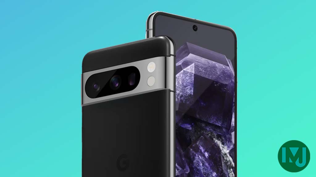
Google Pixel evolves as Europe’s third best selling flagship


