
Google’s response to duplicate Material You colors in Android: An “Intended” Behavior Explained

Google’s Material You design system has been at the core of Android’s visual customization, generating dynamic color palettes that adapt to the wallpaper. However, users of Android 15 have noticed an odd issue: the color palettes generated by Material You sometimes include duplicates, which reduces the variety of options available for personalizing their devices. Despite user feedback, Google has confirmed that this behavior is “working as intended.”
The Evolution of Material You in Android
Material You was introduced to provide a more personalized and dynamic user experience by generating color palettes from the wallpaper. These colors are applied throughout the Android interface, giving users a cohesive and visually appealing experience. Typically, the system generates a dozen or more distinct color options for users to choose from, allowing for broad customization.
However, users began reporting duplicated color palettes in the Android 15 beta releases, which continued even in the final version. Instead of a full set of unique colors, users were seeing multiple identical options. While this behavior was not widely noticed in earlier versions, some users claim that Android 14 did not exhibit the same issue.
Investigating the Duplicate Color Issue
Some reports, such as those from Android Authority, suggest that this issue is unique to Android 15. Yet, on closer examination, users have also observed duplicated color palettes on devices running Android 14, particularly in later builds. This shows that the issue likely started before Android 15 and may not be limited to the latest version.
What’s unusual is that this behavior does not align with previous Android releases like Android 13, where the system generated distinct color options. It seems that the duplication problem is a relatively recent development, raising questions about what might have changed in Android 14 and Android 15 to cause this.
Google’s Response: “Won’t Fix (Intended Behavior)”
When users raised this issue on Google’s Issue Tracker, the company responded by marking the issue as “won’t fix (intended behavior)” in September 2023. Google acknowledged the feedback but stated that the duplication of color palettes is, in fact, how the system is designed to function.
While this explanation has left many users puzzled, it seems that Google believes the system is operating correctly despite the reduction in palette variety.
Possible Reasons for the Duplication
Although Google hasn’t provided a detailed explanation for this decision, one theory is that the system is programmed to display a certain number of color options—typically around 12. If the system doesn’t generate enough unique palettes based on the wallpaper, it may duplicate existing ones to fill the list. While this isn’t an ideal user experience, it would explain why users are seeing duplicated colors instead of more distinct options.
The decision to leave this behavior unchanged has disappointed some users who expect more from Android’s customization options. The lack of variety in the generated palettes could limit the personalization that Material You was designed to enhance.
Will Google Address This in Future Updates?
While Google has marked this issue as resolved for now, there’s still hope that it might be reconsidered in future Android updates. Android 15 is still in its early stages, and updates could potentially address the duplicate palette issue if enough feedback from users and developers is received.
For now, however, users experiencing duplicated color palettes will need to work within the current system or explore third-party customization options.
Conclusion
The duplication of Material You color palettes in Android 15 may seem like an odd quirk, but according to Google, it is intentional. While this reduces the variety of color options for users, it appears to be a deliberate choice, at least for now. As Android evolves, there is always the possibility that Google will revisit this design decision, but for the time being, users may need to adjust their expectations for how much customization they can achieve through Material You.
By addressing the concerns of both users and the tech community, this article provides a clearer understanding of why Google has taken this approach, while also leaving room for potential improvements in future Android releases.


Google is bringing some fresh updates to make Gboard and Android Auto even better.
Starting with Gboard, the Emoji Kitchen now has a new “Browse” section. This makes it easier for users to find different emoji sticker combos. You can tap on any emoji and instantly see all the creative mixes available. Plus, there’s a search bar to help you look for specific stickers. This new feature is rolling out first to Pixel devices, with other Android phones expected to get it in the coming months.
On the other hand, Android Auto is now getting the 14.3 beta update. Although there are no big changes yet, this version mainly focuses on fixing bugs and improving performance. Testers have noticed slight speed improvements, but no new features have been spotted so far. Google might be preparing for bigger changes in future updates.
Both these updates show that Google is working hard to make its apps smoother and easier to use. Gboard’s new browsing tool will make messaging more fun, while Android Auto’s small fixes are important for a better driving experience.
If you have a Pixel phone or are part of the Android Auto beta program, you might already see these updates. Otherwise, they should be available to more users soon.
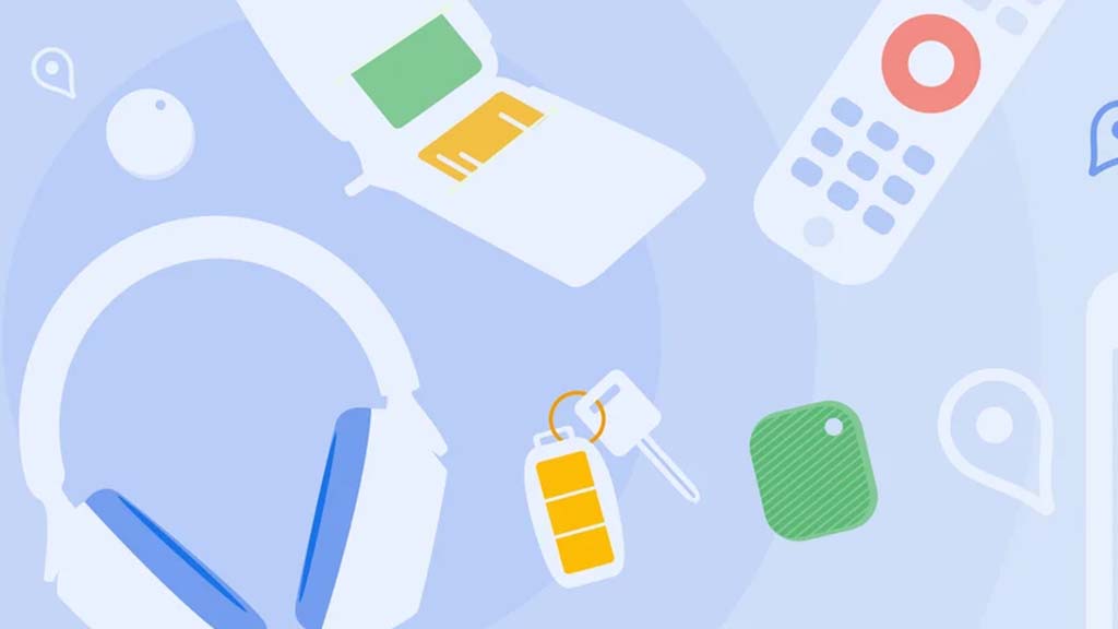
Google’s Find My Device network for Android has gotten a big boost, making it much quicker to locate misplaced items. Recent checks show it’s now four times faster than it used to be, keeping up with Apple’s AirTags in crowded spots like malls or events. For instance, at CES 2025, a tracker tucked in a bag updated its location just as fast as an AirTag nearby. This speed-up is thanks to more Android users turning on tracking for all locations, not only busy areas, which helps the system spot items more reliably.
In less crowded places, the network can still have trouble since fewer Android phones are nearby to share location signals. But Google’s working on this by nudging users through app alerts to enable tracking in quieter spots. Plus, recent updates to tracker software and apps have made connections more stable and accurate.
Looking ahead, Google’s gearing up to roll out ultra-wideband (UWB) technology. This will let you find items with pinpoint accuracy, even within a room, using cool augmented reality (AR) visuals, much like Apple’s setup. The Moto Tag, a tracker ready for UWB, is already available, just waiting for Google to activate this feature. Not all Android phones support UWB yet, but future models like the Pixel 10 might include it. These changes prove Google’s determined to make its Find My Device network a top choice for tracking lost stuff.
Google is giving Gmail and Google Photos some fresh updates to make things easier and more user-friendly.
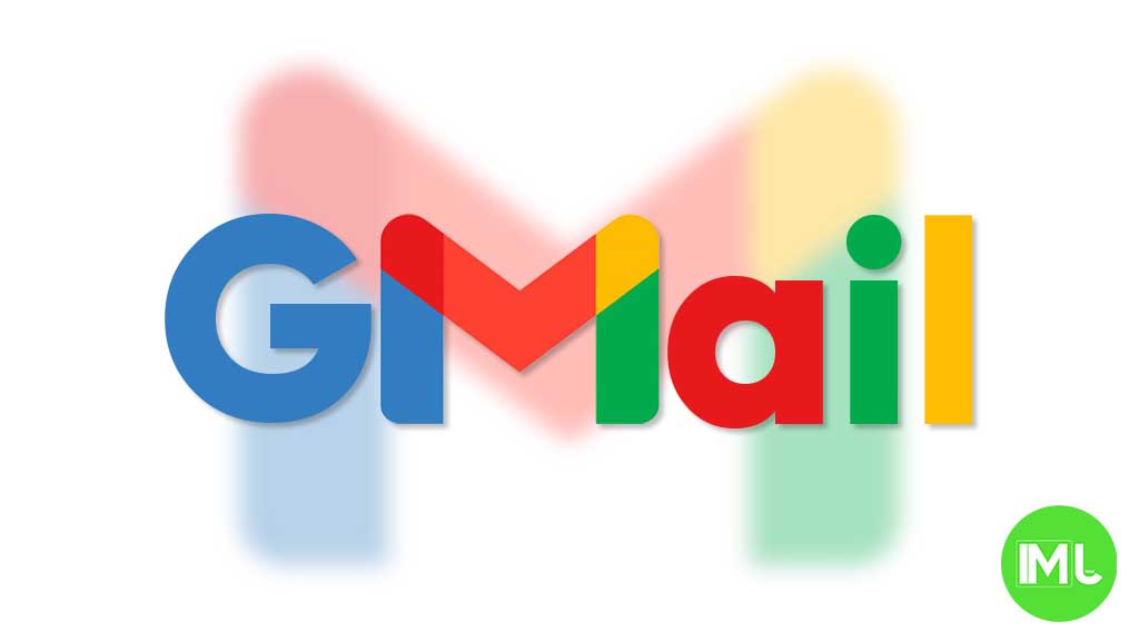
First, Gmail on the web is now getting a new layout option. You can choose between “Cozy,” “Comfortable,” or “Compact” views based on how much space you want between your emails. Google is also adding a setting to control whether your inbox and labels stay on screen or only show up when needed. These changes make it easier to personalize how Gmail looks and feels.
Meanwhile, Gmail for iPhone is getting a visual upgrade. The app now uses Google’s updated design style called “Material 3.” You’ll notice a cleaner look with a rounded search bar at the top, smoother icons, and better spacing. Although the bottom bar and buttons look mostly the same, the overall design feels more modern and easier on the eyes.
Lastly, Google Photos is bringing back a helpful feature. The classic search shortcut that appears in the bottom bar is returning, making it quicker to find your photos. Before this, the shortcut had been removed when Google added the new “Memories” tab. Now, both features work together, letting you browse memories and search with ease.
These updates aim to make Google’s apps feel more useful, clean, and easier to use on both desktop and mobile.
-

 Apps1 year ago
Gboard Proofread feature will support selected text
-

 News1 year ago
Samsung USA crafting One UI 6.1.1
-
News1 year ago
Breaking: Samsung Galaxy S22 may get Galaxy AI features
-
 News1 year ago
Samsung Galaxy S23 Ultra with One UI 6.1 and all S24 AI features revealed
-
News1 year ago
One UI 6.1 Auracast (Bluetooth LE Audio) feature coming to many Samsung phones
-

 News1 year ago
Satellite SOS feature coming to Google Pixel phones, evidence leaked
-
 Apps11 months ago
Google’s fancy new Weather app is finally available for more Android phones
-
 News1 year ago
Google Pixel evolves as Europe’s third best selling flagship