Google rolleout real-time search updates, Gemini dark theme changes, and new features in Google Photos and YouTube
Google is experimenting with multiple updates across its platforms, including Google Search, Gemini, Google Photos, and YouTube. Let’s explore these new features and enhancements:
Google Testing Real-Time Search Results with Conversational AI
Google is testing a real-time update feature for its Search app that could make search results more dynamic, similar to interactions with AI chatbots like Gemini. The goal is to offer a more conversational search experience, aligning it with the growing trend of Generative AI (Gen AI).
Key Highlights:
- Real-Time Updates with Voice Search:
- Google is reportedly testing a version of the Search app where results refresh in real-time as users speak. This would allow users to have a more interactive experience, similar to having a conversation with an AI chatbot.
- According to leaked demos on X (formerly Twitter) by AssembleDebug, users can ask follow-up questions, and the search results page will update continuously without requiring manual input.
- Integration with Generative AI:
- This update appears to mimic the capabilities of Gemini Live, an AI platform from Google that already supports conversational responses. Google seems to be focusing on making its Search feature more intuitive and interactive, catering to users who prefer AI-driven solutions for quick and sequential answers.
- Currently, Google Search provides Gemini AI Overviews, but it is not as seamless as a real-time chatbot experience. This new feature could bridge that gap, offering a continuous conversational flow without interruptions.
- What’s Next?:
- Although this conversational search mode is not yet officially available, Google seems to be testing it internally. Given the existing integration of conversational AI in other Google services, it might soon become a standard feature in the Search app.
Gemini Gets a New Dark Theme Update
Google’s Gemini platform recently underwent some visual changes, particularly to its dark theme on the web. This update reflects Google’s ongoing efforts to improve the user experience across its services.
Key Changes:
- Lighter Dark Theme:
- The dark mode now features a lighter shade of gray rather than the previously used deep black or dark gray. This aligns Gemini’s appearance more closely with Google Search’s dark theme, providing a unified look across Google’s platforms.
- Consistent Design Language:
- The update has been applied to various parts of Gemini’s web interface, including the side panel and search fields. However, some sections like the Extensions page still show inconsistencies, indicating that a full rollout might be in progress.
- Android and iOS Updates:
- While the web and Android versions of Gemini have received this new look, similar changes for iOS users have yet to be confirmed.
Google Photos Introduces a New ‘Updates’ Page
Google Photos has revamped its interface by replacing the “Sharing” tab with a new “Updates” feed, making it easier for users to stay informed about recent activities.
Features of the New Updates Page:
- Organized Activity Feed:
- The Updates feed now organizes notifications based on timeframes such as “today,” “yesterday,” “this week,” and “last month.” This helps users quickly find recent changes or updates in their shared content.
- Enhanced Accessibility:
- The new feed displays updates related to shared albums, conversations, partner sharing, and memory updates, giving users a comprehensive view of their photo-sharing activities.
- Users can now easily access shared albums by navigating to the “Collections” tab, where they can filter between “All,” “Shared with me,” and “My albums.”
- Rollout and Availability:
- This new feature is being gradually rolled out to Android and iOS users, with full availability expected in the coming weeks.
YouTube’s Playback Speed Control Redesign
YouTube has introduced a more user-friendly design for adjusting playback speed in its Android and iOS apps, focusing on making the interface simpler and easier to use.
What’s New in Playback Speed Controls:
- Compact and Accessible UI:
- The previous playback speed options appeared as a tall list occupying a significant part of the screen. The new design features a shorter, bottom-row UI that is easier to access with one hand.
- The updated control layout includes five preset speed options: 0.25x, 1.0x (Normal), 1.25x, 1.5x, and 2.0x, displayed in pill-shaped buttons for easy selection.
- Slider for Fine-Tuning:
- A new slider allows users to adjust the playback speed in increments of 0.5x, providing more granular control over video playback.
- The slider is complemented by ‘plus’ and ‘minus’ buttons, letting users quickly increase or decrease the speed.
- Server-Side Rollout:
- The redesign is being rolled out as a server-side update, available with version 19.43 on Android and 19.44 on iOS. Users should see this new feature without needing to update the app manually.
Conclusion
Google’s latest updates show its commitment to enhancing user experience across its various apps and services. By testing real-time search results, refining visual elements in Gemini, overhauling the sharing experience in Google Photos, and simplifying playback controls in YouTube, Google is setting the stage for a more intuitive and seamless interaction across its ecosystem. These changes aim to align Google’s offerings with the increasing demand for AI-driven, user-friendly features, making it easier for users to access information and interact with content on their devices.
As Google continues to experiment and refine these features, users can expect a more integrated experience across its platforms, driven by a blend of AI capabilities and user-centered design improvements.
Android
Android’s Find My Device speeds up with UWB coming soon

Google’s Find My Device network for Android has gotten a big boost, making it much quicker to locate misplaced items. Recent checks show it’s now four times faster than it used to be, keeping up with Apple’s AirTags in crowded spots like malls or events. For instance, at CES 2025, a tracker tucked in a bag updated its location just as fast as an AirTag nearby. This speed-up is thanks to more Android users turning on tracking for all locations, not only busy areas, which helps the system spot items more reliably.
In less crowded places, the network can still have trouble since fewer Android phones are nearby to share location signals. But Google’s working on this by nudging users through app alerts to enable tracking in quieter spots. Plus, recent updates to tracker software and apps have made connections more stable and accurate.
Looking ahead, Google’s gearing up to roll out ultra-wideband (UWB) technology. This will let you find items with pinpoint accuracy, even within a room, using cool augmented reality (AR) visuals, much like Apple’s setup. The Moto Tag, a tracker ready for UWB, is already available, just waiting for Google to activate this feature. Not all Android phones support UWB yet, but future models like the Pixel 10 might include it. These changes prove Google’s determined to make its Find My Device network a top choice for tracking lost stuff.
Gmail and Google Photos get new design and useful updates
Google is giving Gmail and Google Photos some fresh updates to make things easier and more user-friendly.
First, Gmail on the web is now getting a new layout option. You can choose between “Cozy,” “Comfortable,” or “Compact” views based on how much space you want between your emails. Google is also adding a setting to control whether your inbox and labels stay on screen or only show up when needed. These changes make it easier to personalize how Gmail looks and feels.
Meanwhile, Gmail for iPhone is getting a visual upgrade. The app now uses Google’s updated design style called “Material 3.” You’ll notice a cleaner look with a rounded search bar at the top, smoother icons, and better spacing. Although the bottom bar and buttons look mostly the same, the overall design feels more modern and easier on the eyes.
Lastly, Google Photos is bringing back a helpful feature. The classic search shortcut that appears in the bottom bar is returning, making it quicker to find your photos. Before this, the shortcut had been removed when Google added the new “Memories” tab. Now, both features work together, letting you browse memories and search with ease.
These updates aim to make Google’s apps feel more useful, clean, and easier to use on both desktop and mobile.
Android
Android 16 boosts USB data safety and fixes delayed notifications on Pixel phones
Google’s upcoming Android 16 update is bringing better security and some helpful improvements, especially for Pixel phone users. One of the main features in Android 16 is a new way to protect your phone’s data when it’s connected to a computer through USB. Right now, when you plug your phone into a PC or laptop, it can access all your data as long as you approve it.
With Android 16, Google is adding an extra security layer that only allows limited access unless you enter your PIN, password, or use your fingerprint. This will help protect your files if someone tries to access your phone without permission.
At the same time, Google is also working on a fix for a frustrating issue that some Pixel users have been facing for months — delayed notifications. After the April 2024 update, many users noticed that app alerts were not showing up on time, especially from messaging apps. Google has confirmed the problem and says a fix will be included in a future update, though it’s not in the current April patch yet.
Together, these changes show that Google is focusing on both stronger privacy and a smoother experience for Android and Pixel users. Android 16 is expected to roll out later this year, starting with developer previews.
-

 Apps1 year ago
Gboard Proofread feature will support selected text
-

 News1 year ago
Samsung USA crafting One UI 6.1.1
-

 News1 year ago
Breaking: Samsung Galaxy S22 may get Galaxy AI features
-

 News1 year ago
Samsung Galaxy S23 Ultra with One UI 6.1 and all S24 AI features revealed
-

 News1 year ago
One UI 6.1 Auracast (Bluetooth LE Audio) feature coming to many Samsung phones
-

 News1 year ago
Satellite SOS feature coming to Google Pixel phones, evidence leaked
-
 Apps11 months ago
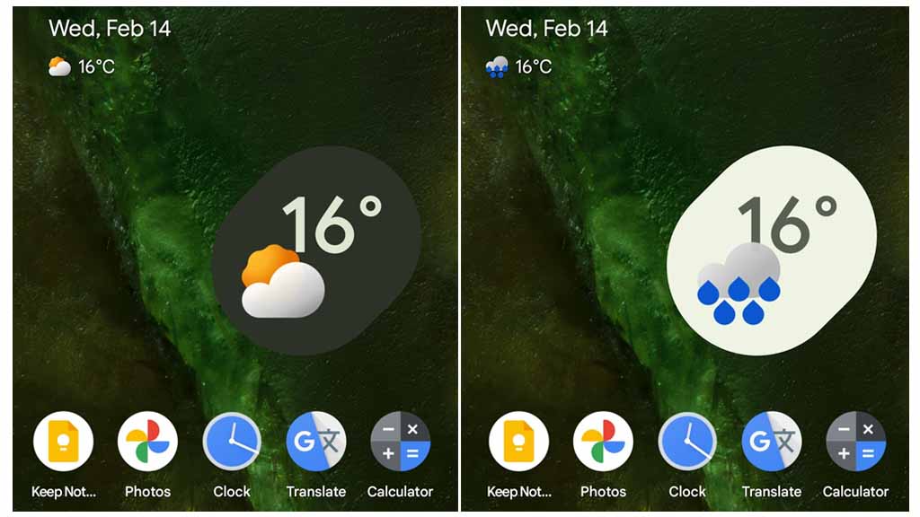
Google’s fancy new Weather app is finally available for more Android phones
-

 News1 year ago
Google Pixel evolves as Europe’s third best selling flagship


