
Pixel Buds Pro 2 and Enhanced AI Features: Noise cancellation, transparency mode, and ‘At a Glance’ sports updates

Google’s Pixel Buds Pro 2 have taken a significant leap forward in audio technology, featuring the new custom Tensor A1 chip and advanced features like transparency mode enhancements. Additionally, Google’s ‘At a Glance’ widget on Pixel devices could soon include sports updates, offering even more contextual information. Let’s dive into the innovations and what they mean for users.
Why Pixel Buds Pro 2 Use Tensor A1: Beyond Off-the-Shelf Chips
When developing the Pixel Buds Pro 2, Google set ambitious goals: improving noise cancellation and audio quality while maintaining a compact design. The solution was the Tensor A1 chip, custom-designed to meet these needs. Off-the-shelf audio chips simply didn’t provide the performance or power efficiency required.
- Enhanced Noise Cancellation: The Tensor A1 dramatically increases the speed of audio processing, from the original Pixel Buds Pro’s 5–6 times the speed of sound to an impressive 90 times. This allows the earbuds to isolate external sounds, cancel noise, and generate “anti-noise” for any sound leakage before it reaches your ears.
- Independent Audio Pathways: By separating audio processing from active noise cancellation (ANC), the earbuds ensure better sound clarity and consistent ANC performance.
Google’s Silicon team developed the Tensor A1 based on performance benchmarks, computational needs, and energy efficiency targets provided by the Pixel Buds team. The chip design, finalized in 2023, paved the way for the Buds Pro 2’s September 2024 launch.
Design and Comfort: A Focus on Ergonomics
Google also reimagined the physical design of the Pixel Buds Pro 2 for improved comfort and fit. The company analyzed where earbuds naturally sit in the ear and where they could cause pressure. This research led to the inclusion of a stabilizer fin that locks the earbuds securely in place.
To ensure comfort and usability, Google expanded its testing pool to include a broader range of participants. By standardizing surveys and removing bias, they gathered data to refine the design and fit further.
Transparency Mode: Clearer Surroundings, Future Enhancements
Transparency mode, a feature that lets users hear external sounds while listening to audio, received significant improvements. Testing revealed that users prioritized the absence of unnatural sound artifacts, such as distorted ambient sounds. Google refined the mode to provide more natural audio replication.
- Future Focus Areas: Upcoming developments may include enhancements for self-voice clarity, which will improve how users hear their own voices during conversations while using transparency mode.
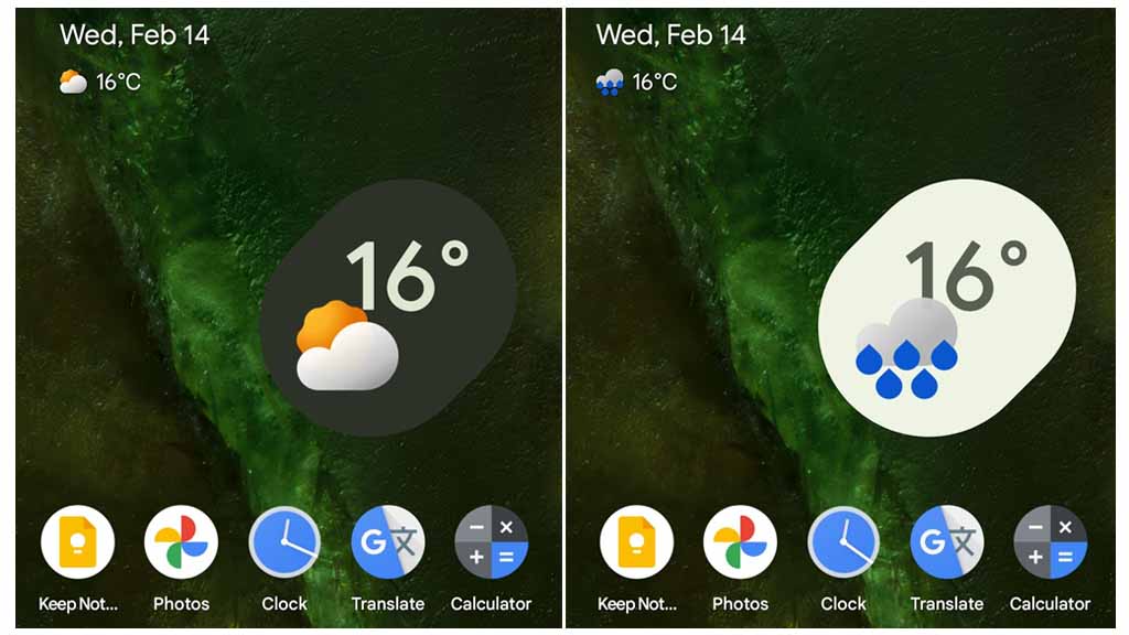
Pixel ‘At a Glance’ Widget: Sports Scores on the Horizon
Google’s ‘At a Glance’ widget may soon become more feature-rich, with plans to include live sports updates. This feature will pull scores and updates directly from the Google app, making them visible on your lock screen or home screen.
- Gemini Branding: Code references suggest the widget might adopt Google’s Gemini branding. While the specifics are unclear, this could imply AI-based summarization of sports scores, moving beyond simple notifications.
Currently, sports updates in ‘At a Glance’ remain unavailable, but the inclusion signals Google’s focus on integrating real-time, context-aware information into its ecosystem.
Availability and Pricing
The Pixel Buds Pro 2 are already available for purchase, with a Black Friday discount of $50 on the Google Store and select retailers. These advancements highlight Google’s commitment to pairing cutting-edge audio technology with user-centric design.
Final Thoughts: A Blend of Innovation and AI Integration
The Pixel Buds Pro 2 represent a step forward in personalized audio experiences, thanks to the Tensor A1 chip and refined noise-canceling capabilities. Meanwhile, features like sports scores in the ‘At a Glance’ widget point to Google’s broader vision of integrating AI-driven insights into everyday user interactions. Whether through better audio processing or smarter contextual updates, these innovations make Google’s ecosystem increasingly intuitive and seamless.


Google’s upcoming Pixel Watch 4 is creating buzz with its sleek and modern design, revealed through recent leaks. The smartwatch keeps the signature circular shape that fans love, but it brings some fresh updates that make it stand out.
The Pixel Watch 4 has a smooth, rounded body with a shiny finish, giving it a stylish and polished look. Its digital crown, a key feature for easy navigation, is slightly larger this time, making it simpler to use. The watch also seems to have a thinner frame, which could mean a bigger screen for viewing notifications, apps, or fitness stats.
Leaked images show the watch in multiple colors, including a classic black, a soft silver, and a bold new shade that might catch attention. The straps look comfy and interchangeable, so users can switch up their style easily. Whether you’re dressing up or keeping it casual, the Pixel Watch 4 seems ready to match any vibe.
On the tech side, rumors suggest the Pixel Watch 4 will run on Google’s latest Wear OS, offering smoother performance and better battery life. It’s expected to pack advanced health features like heart rate tracking, sleep monitoring, and possibly even stress detection. These tools aim to help users stay on top of their wellness goals.
The leaked video gives a 360-degree view of the watch, highlighting its slim design and vibrant display. While Google hasn’t shared an official release date yet, the Pixel Watch 4 is shaping up to be a strong contender in the smartwatch world. Fans are excited to see how it will blend style and smart features when it finally hits the market.
Google has made some tough calls recently, letting go of employees working on its Pixel phones, Android system, and Fitbit devices. The layoffs, which happened earlier this week, affected a small number of staff members, including some managers. The company hasn’t shared exact details about how many people lost their jobs or which teams were hit hardest, but the changes are part of a bigger plan to work smarter and focus on key projects.
Even with these cuts, Google says it’s still committed to building great Pixel phones and improving Android. The company believes these changes will help its teams work better together and create products that users love. Some of the employees who were let go might get a chance to apply for other roles within Google, but it’s not guaranteed that everyone will stay.
This isn’t the first time Google has trimmed its workforce. Last year, it cut jobs in other areas, like its Waze mapping app, as part of efforts to save money and streamline operations. Despite the layoffs, Google insists its plans for Pixel, Android, and Fitbit remain strong. The company is pushing forward with new ideas and products to compete in the crowded tech world.
The news has raised questions about what’s next for Google’s hardware and software teams. Fans of Pixel phones and Android are hopeful the changes won’t slow down the company’s progress. For now, Google is staying focused on delivering updates and new devices while navigating these internal shifts. Only time will tell how these changes shape the future of its products.
Google Keep’s widget on Android is getting a makeover to make it more user-friendly. The updated design, now rolling out, uses space better and looks cleaner. The Quick Capture widget, shaped like a clover, now fills its area completely, making it easier to tap.
When resized, it adjusts smartly: a small 2×1 size turns into a single button, while a larger 2×2 size shows note options clearly. The 3×1 version is bigger and simpler to use. This change matches Google’s style for other apps, like Drive, and is part of Keep’s latest update. You might need to reinstall the widget to see it.
Meanwhile, Google Messages could soon look less colorful. The app has been using bright Material You themes, which pull colors from your phone’s wallpaper. But some users find them too bold. A new test shows Messages might switch to simpler, more neutral tones. This would make chats easier on the eyes, especially for those who prefer a clean look. The change isn’t final yet—it’s just being tried out in beta versions. If it goes through, it could make the app feel calmer and more focused.
Both updates show Google tweaking its apps to balance style and function. Keep’s widget aims to make note-taking smoother, while Messages might offer a less distracting chat experience. These changes are gradual, so not everyone will see them right away. Keep an eye out for updates to try them yourself!
-

 Apps1 year ago
Gboard Proofread feature will support selected text
-

 News1 year ago
Samsung USA crafting One UI 6.1.1
-
News1 year ago
Breaking: Samsung Galaxy S22 may get Galaxy AI features
-
 News1 year ago
Samsung Galaxy S23 Ultra with One UI 6.1 and all S24 AI features revealed
-
News1 year ago
One UI 6.1 Auracast (Bluetooth LE Audio) feature coming to many Samsung phones
-

 News1 year ago
Satellite SOS feature coming to Google Pixel phones, evidence leaked
-
 Apps11 months ago
Google’s fancy new Weather app is finally available for more Android phones
-
 News1 year ago
Google Pixel evolves as Europe’s third best selling flagship