
Google Discover’s new look raises eyebrows

Google Discover recently changed its design, and not everyone is happy about it. The update brings a full-screen layout that stretches across the whole display, replacing the simpler, card-style look from before. This new style aims to make articles and videos stand out more, but some users find it messy and hard to use.
The old version showed neat, bite-sized previews you could scroll through easily. Now, the bigger, wider setup feels overwhelming to some, with giant images and headlines taking over the screen. Google says this change is meant to grab attention and keep people engaged, but critics argue it sacrifices comfort for flashiness.
A few folks like the bold, modern vibe, saying it makes browsing more fun. Others, though, miss the clean, organized feel of the original. There’s no word yet on whether Google will tweak this redesign based on feedback or stick with it. For now, users are left to adjust to this eye-catching but divisive update. What do you think of the new Google Discover? Love it or hate it, it’s clear this shift is sparking plenty of chatter online!


Google is rolling out two helpful updates for its popular apps — Google Photos and Google Maps — aiming to make things faster and easier for Android users.
First, Google Photos is introducing a new “Quick Edit” feature that lets you quickly tweak your photos without fully opening the edit menu. A small pencil icon now appears at the bottom of each photo. Tapping it brings up suggested edits powered by AI, letting you apply improvements with just one tap. This tool is especially handy for small fixes like lighting or color adjustments. While it’s starting to roll out, not everyone will see it immediately. Some changes might still open the full editor depending on the photo.
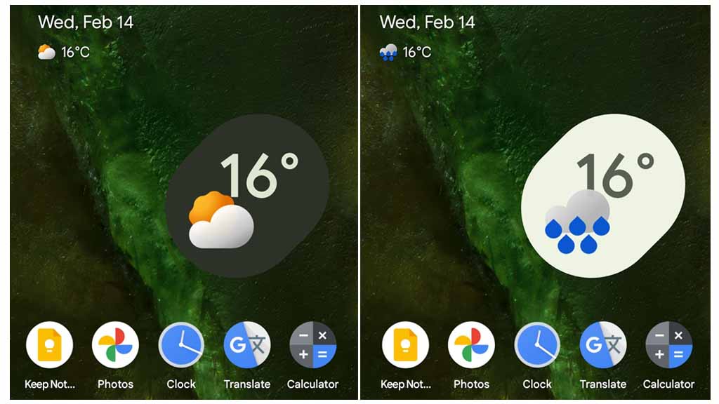
At the same time, Google Maps is testing a fresh look for its place sheets — the bottom panel that shows up when you tap on a location. The new design includes more rounded corners, a cleaner layout, and easier access to options like directions, saving, or sharing a place. This redesigned panel also keeps the location’s name, rating, and category in clearer view. It feels more modern and easier to navigate.
Both updates are gradually rolling out, so it might take a little time before they reach all Android users. These changes show Google’s ongoing efforts to make its apps more user-friendly and visually appealing.
Google is rolling out two new updates that aim to improve the experience on Android devices, including the Pixel Watch and Android phones.
First, the Pixel Watch is getting upgraded media controls. With the new update, users can now swipe between different media apps like Spotify and YouTube Music more easily. Instead of going back and forth through menus, you can just swipe left or right to switch apps. The update also adds a shortcut to quickly launch the full media app right from the watch. This makes listening to music or podcasts much smoother and faster.
Meanwhile, Google is testing a new feature for Android phones called the “bubble bar.” This new feature is meant to replace or enhance the current taskbar and app dock. It looks like a small floating bar with app icons, similar to bubbles. Users can easily switch between apps without going back to the home screen. The bubble bar could be especially helpful for larger-screen devices like foldables or tablets, making multitasking simpler.
These updates show how Google is working to make Android more user-friendly across different devices. While the Pixel Watch update is starting to roll out now, the bubble bar is still being tested, so it may take a while before it becomes available to everyone.
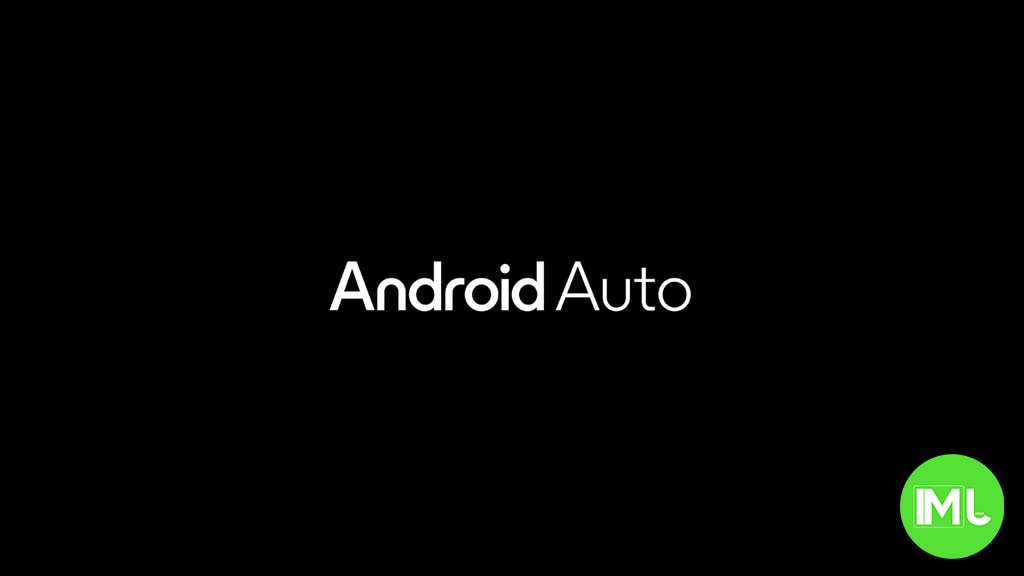
Android Auto has recently had a small but annoying problem—its weather card isn’t showing up for many users. Usually, this feature shows the current temperature and weather condition in the top corner of the dashboard, which is helpful while driving. But now, for a lot of people, it’s either missing or just showing a blank space.
Reports about this issue have been popping up on Google’s support forums and Reddit over the past week. Some users say the card disappeared after a recent Android Auto update, while others noticed it went away without any changes to their apps or settings.
What’s odd is that Google hasn’t confirmed if this is a bug or a planned change. As of now, there’s no official fix or update. Some users tried restarting their phones, clearing cache, or reinstalling the app, but these steps didn’t work for everyone.
This isn’t the first time something like this has happened. Android Auto has had similar issues with the weather card in the past, which were usually fixed through updates. Until Google releases a fix or gives more info, users will just have to wait and hope the card comes back soon.
If you’re affected, it’s a good idea to keep your app and phone updated in case a fix rolls out.
-

 Apps1 year ago
Gboard Proofread feature will support selected text
-

 News1 year ago
Samsung USA crafting One UI 6.1.1
-
News1 year ago
Breaking: Samsung Galaxy S22 may get Galaxy AI features
-
 News1 year ago
Samsung Galaxy S23 Ultra with One UI 6.1 and all S24 AI features revealed
-
News1 year ago
One UI 6.1 Auracast (Bluetooth LE Audio) feature coming to many Samsung phones
-

 News1 year ago
Satellite SOS feature coming to Google Pixel phones, evidence leaked
-
 Apps11 months ago
Google’s fancy new Weather app is finally available for more Android phones
-
 News1 year ago
Google Pixel evolves as Europe’s third best selling flagship