
Google I/O 2025 dates announced: May 20-21
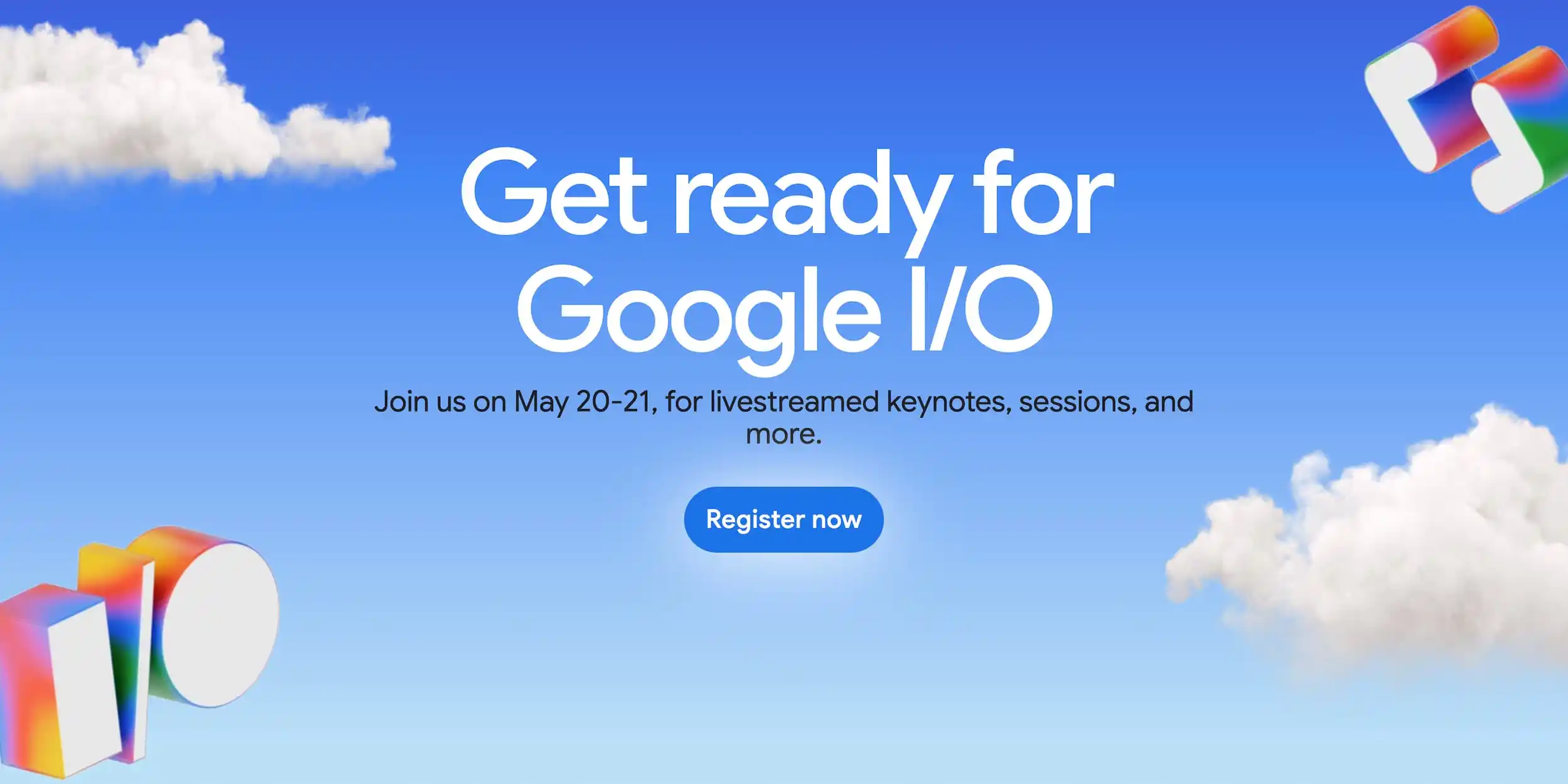
Google has just revealed that the Google I/O 2025 conference will happen on May 20th and 21st. At this event, you’ll discover all about Google’s latest gadgets, tech, and advancements in AI.
The event starts with a big speech by Google’s boss, Sundar Pichai, at the Shoreline Amphitheater in Mountain View, California, at 10 AM Pacific Time. After that, there will be talks for developers and some sessions online for everyone to watch. This year, they’re doing something new by live streaming developer talks from Shoreline over both days.
On the first day, we’ll have speeches, discussions, hands-on workshops, demos, and chances to meet others. These activities will continue into the second day. Since 2016, Google has been holding I/O at this concert venue close to their office, except in 2020 when there was no event, and the next year it was all online. This year’s setup is similar to last year’s.
Google will share the full plan and list of talks as we get closer to the event. You can sign up for free starting today.
By registering for Google I/O 2025, you’ll get updates on the schedule, content, and other developer news right in your email. Plus, you can make a profile in the Google Developer Program to make your digital experience more tailored to what interests you.
Look out for lots of news on AI, including Gemini, and updates on Android 16. The I/O website has a section called “Start building today” which talks about the Gemma open model, Google AI Studio, and NotebookLM.
Google also mentions they’ll cover Android, AI, the web, cloud, and more. Come to the conference to see how new AI can help you make cool apps and streamline your coding. We’ll also show you how we’re making Android development simpler and helping you create better, more interactive websites.


Google’s upcoming Pixel Watch 4 is creating buzz with its sleek and modern design, revealed through recent leaks. The smartwatch keeps the signature circular shape that fans love, but it brings some fresh updates that make it stand out.
The Pixel Watch 4 has a smooth, rounded body with a shiny finish, giving it a stylish and polished look. Its digital crown, a key feature for easy navigation, is slightly larger this time, making it simpler to use. The watch also seems to have a thinner frame, which could mean a bigger screen for viewing notifications, apps, or fitness stats.
Leaked images show the watch in multiple colors, including a classic black, a soft silver, and a bold new shade that might catch attention. The straps look comfy and interchangeable, so users can switch up their style easily. Whether you’re dressing up or keeping it casual, the Pixel Watch 4 seems ready to match any vibe.
On the tech side, rumors suggest the Pixel Watch 4 will run on Google’s latest Wear OS, offering smoother performance and better battery life. It’s expected to pack advanced health features like heart rate tracking, sleep monitoring, and possibly even stress detection. These tools aim to help users stay on top of their wellness goals.
The leaked video gives a 360-degree view of the watch, highlighting its slim design and vibrant display. While Google hasn’t shared an official release date yet, the Pixel Watch 4 is shaping up to be a strong contender in the smartwatch world. Fans are excited to see how it will blend style and smart features when it finally hits the market.

Google has made some tough calls recently, letting go of employees working on its Pixel phones, Android system, and Fitbit devices. The layoffs, which happened earlier this week, affected a small number of staff members, including some managers. The company hasn’t shared exact details about how many people lost their jobs or which teams were hit hardest, but the changes are part of a bigger plan to work smarter and focus on key projects.
Even with these cuts, Google says it’s still committed to building great Pixel phones and improving Android. The company believes these changes will help its teams work better together and create products that users love. Some of the employees who were let go might get a chance to apply for other roles within Google, but it’s not guaranteed that everyone will stay.
This isn’t the first time Google has trimmed its workforce. Last year, it cut jobs in other areas, like its Waze mapping app, as part of efforts to save money and streamline operations. Despite the layoffs, Google insists its plans for Pixel, Android, and Fitbit remain strong. The company is pushing forward with new ideas and products to compete in the crowded tech world.
The news has raised questions about what’s next for Google’s hardware and software teams. Fans of Pixel phones and Android are hopeful the changes won’t slow down the company’s progress. For now, Google is staying focused on delivering updates and new devices while navigating these internal shifts. Only time will tell how these changes shape the future of its products.
Google Keep’s widget on Android is getting a makeover to make it more user-friendly. The updated design, now rolling out, uses space better and looks cleaner. The Quick Capture widget, shaped like a clover, now fills its area completely, making it easier to tap.
When resized, it adjusts smartly: a small 2×1 size turns into a single button, while a larger 2×2 size shows note options clearly. The 3×1 version is bigger and simpler to use. This change matches Google’s style for other apps, like Drive, and is part of Keep’s latest update. You might need to reinstall the widget to see it.
Meanwhile, Google Messages could soon look less colorful. The app has been using bright Material You themes, which pull colors from your phone’s wallpaper. But some users find them too bold. A new test shows Messages might switch to simpler, more neutral tones. This would make chats easier on the eyes, especially for those who prefer a clean look. The change isn’t final yet—it’s just being tried out in beta versions. If it goes through, it could make the app feel calmer and more focused.
Both updates show Google tweaking its apps to balance style and function. Keep’s widget aims to make note-taking smoother, while Messages might offer a less distracting chat experience. These changes are gradual, so not everyone will see them right away. Keep an eye out for updates to try them yourself!
-

 Apps1 year ago
Gboard Proofread feature will support selected text
-

 News1 year ago
Samsung USA crafting One UI 6.1.1
-
News1 year ago
Breaking: Samsung Galaxy S22 may get Galaxy AI features
-
 News1 year ago
Samsung Galaxy S23 Ultra with One UI 6.1 and all S24 AI features revealed
-
News1 year ago
One UI 6.1 Auracast (Bluetooth LE Audio) feature coming to many Samsung phones
-

 News1 year ago
Satellite SOS feature coming to Google Pixel phones, evidence leaked
-
 Apps11 months ago
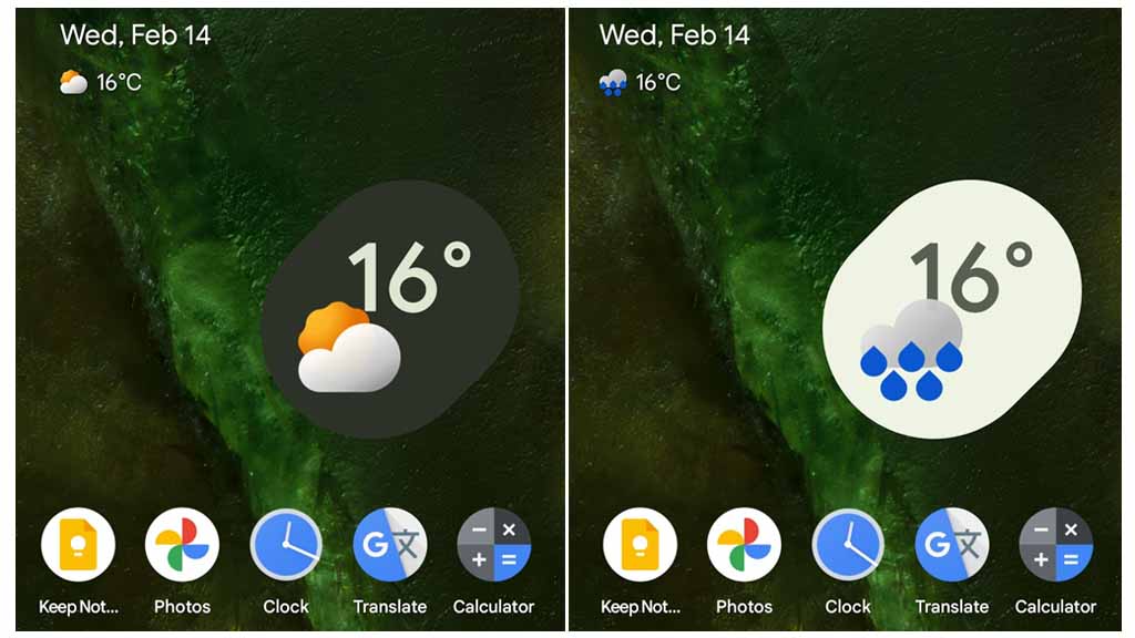
Google’s fancy new Weather app is finally available for more Android phones
-
 News1 year ago
Google Pixel evolves as Europe’s third best selling flagship