Google Contacts removes ‘Recently Added’ section and prepares for new ‘Pixel Besties’ widget
Top 3 Key Points:
- Google Contacts has removed the “Recently Added” section from the Highlights tab.
- The upcoming “Pixel Besties” widget will allow users to view recent interactions and memories with their favorite contacts.
- The update simplifies the user interface but might limit the visibility of recently added contacts.
In recent updates to Google Contacts for Android, the app has made a few significant changes, including the removal of the “Recently Added” section from the Highlights tab. Initially introduced in late 2022, the Highlights tab featured a section displaying your most recently added and viewed contacts. However, with the latest update, Google has decided to streamline this feature by removing the “Recently Added” section altogether.
The Highlights tab still includes the Favorites grid, birthday reminders in the “For you” section, and a “Recents” area that now indirectly serves the function of showing newly added contacts. When you create a new contact, it will automatically appear in the “Recents” list after being saved. You can still find the specific “Added” date for any contact at the bottom of their details page.
This change is part of the Google Contacts version 4.38.x update, might have been made to simplify the user interface. It also could be due to the fact that the “Recently Added” section only displayed contacts created locally on your device and didn’t account for contacts added via the web.
In addition to these updates, Google is also working on a new feature called the “Pixel Besties” widget. This widget is designed to help users stay connected with their favorite contacts by displaying recent communications and shared memories. The widget, which will support up to seven starred contacts, seems to build on the existing Individual contact widget, expanding its functionality to provide a more comprehensive view of your interactions with your favorite people. However, the final design and complete features of this widget are still under development.
These changes indicate Google’s ongoing efforts to refine the user experience in Google Contacts, making it more intuitive and focused on what matters most to users.
Google Photos and Drive redesigned for better navigation
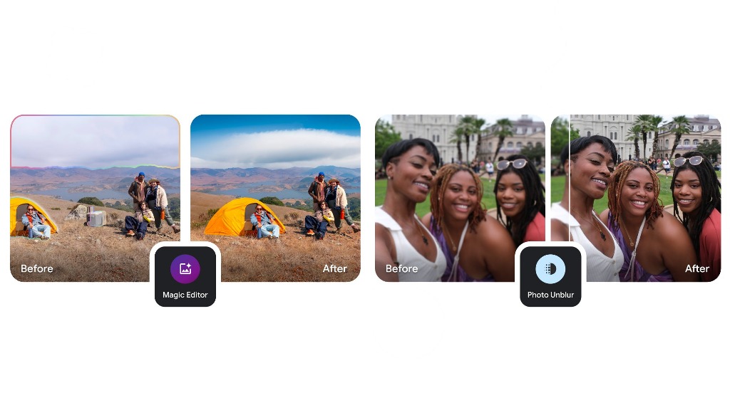
Google has rolled out significant updates to the navigation and interface of Google Photos on the web and the Google Drive file picker on Android. These changes aim to enhance user experience by making it easier to access important features and files. Let’s dive into the updates.
Google Photos Introduces “Collections” on the Web
After launching the Collections feature on Android and iOS in August, Google Photos has now brought it to the web, replacing the Library section. The redesigned interface simplifies navigation while aligning with the mobile app’s layout.
Key Changes in Google Photos Web:
- Side Panel Updates:
- The Explore tab has been removed.
- Sharing has been replaced by an Updates tab, which provides:
- Notifications for shared albums, conversations, partner sharing, memories, and storage updates.
- A refreshed design consistent with the mobile app, introduced earlier in November.
- Introducing “Collections”:
- The former Library section is now called Collections.
- The interface prioritizes dropdowns for Albums and Documents, moving Favorites down the list.
- Quick-access categories now include:
- People & Pets
- Places
- Videos
- Recently Added
- These changes mimic the grid-style organization introduced earlier for mobile users.
- Other Menu Updates:
- Archive, Locked Folder, and Trash are easily accessible.
- While the new layout is busier, it takes full advantage of the web’s larger screen real estate.
This redesigned Collections view has been gradually rolled out in recent days, streamlining organization for desktop users.
Google Drive File Picker Gets a Smarter Redesign on Android
The Google Drive file picker, used in apps like Gmail, Google Chat, and other Workspace tools, has received a much-needed update on Android. The changes focus on improving file visibility and reducing navigation steps.
What’s New in the Google Drive File Picker?
- New Carousel Layout:
- The previous list view (which displayed My Drive, Computers, Shared with Me, Starred, and Recent) has been replaced by a carousel format.
- Users can now see folders/views at the top, with a list of Recent files displayed immediately upon opening the picker.
- Improved Usability:
- The update eliminates extra taps, making it quicker to find recently accessed files.
- Users can still toggle between list view and grid view for flexibility.
- Enhanced Clarity:
- Google explains that the new layout highlights storage locations beyond “My Drive,” including shared drives and other items you can access.
Where to See the Update?
This redesigned picker is live in:
- Gmail: Under Compose > paperclip icon > Insert from Drive.
- Google Chat: Under conversation > plus menu > Drive.
The web version of the file picker received a similar redesign last year, setting the stage for a more unified experience across platforms.
Why These Updates Matter
Both updates emphasize efficiency and usability:
- Google Photos’ Collections provides faster access to key categories, aligning web and mobile experiences.
- The Drive file picker redesign simplifies file selection, especially for shared work environments.
These changes underscore Google’s ongoing commitment to making their apps more intuitive and productive for users across devices. If you’re using these features, be sure to check out the latest updates for a smoother experience.
Android
Google updates Pixel Camera 9.6 and previews Wear OS 5.1 with new features
Google Pixel Camera 9.6: New Features and Wider Availability
Google’s Pixel Camera 9.6 update, first released in mid-October, is now available to more users via the Google Play Store. This update introduces new features for different Pixel devices, enhancing the user experience with innovative tools and improvements.
Initially, some users were stuck on previous versions like 9.4 (for Pixel 6 to Pixel 8a) and 9.5 (for Pixel 9 series). Recently, Google pushed a patch, version 9.6.080.695519101.19, ensuring all users can access the latest features.
Key Updates in Pixel Camera 9.6
- Improved Timer Options:
Pixel 6 to Pixel 8a owners now have a 5-second timer option alongside the existing 3- and 10-second settings, offering more flexibility for capturing moments. - Enhanced Astrophotography Mode:
Accessing Astrophotography mode is easier. From the Night Sight tab, tap the bottom-right corner and slide to “Astro” to capture stunning shots of the night sky. - Underwater Photography for Pixel 9 Series:
Pixel 9 devices now include an “Underwater photography and video” option under Settings > Advanced. This feature, compatible with any waterproof case, adjusts for accurate colors in underwater environments. When enabled, the viewfinder indicates the mode is active. Unfortunately, this feature is not available on the Pixel 9 Pro Fold. - Redesigned Panorama Mode:
Users can now capture panorama shots while holding their devices vertically. Previously, this feature only supported horizontal orientation.
Google Wear OS 5.1: A Glimpse Into the Future
Google has launched a developer preview for Wear OS 5.1, built on Android 15 (API level 35). This update marks a significant leap forward, bringing enhancements to app functionality and new tools for wearable developers.
Evolution of Wear OS:
- Wear OS 3: Based on Android 11
- Wear OS 4: Based on Android 13
- Wear OS 5: Based on Android 14
- Wear OS 5.1: Now based on Android 15
Developers are encouraged to test their apps on API level 35 to ensure compatibility and take advantage of the new capabilities.
Highlighted Features in Wear OS 5.1
- Credential Manager Support:
A unified authentication system simplifies sign-ins using passwords, passkeys, or federated identities (e.g., Sign In with Google). Credentials sync across devices through a credential provider, enhancing security and convenience. - Watch Speaker Playback:
For watches with built-in speakers, users can now select the watch speaker as an output option for media playback. This feature, integrated with the Wear Output Switcher, adds flexibility.
Currently, devices like the Pixel Watch 3 and YouTube Music require Bluetooth headphones for playback, but this update signals a shift. For example, Apple introduced speaker playback on its Apple Watch Series 10, highlighting its practicality for quick audio needs.
Additional Updates and Known Issues
Google also teased support for passkeys in a “Wear OS 5 Quarterly Platform Release” during the 2024 I/O conference.
The Wear OS 5.1 developer preview, released on November 19, includes the following known issues:
- The emulator may fail to let users add accounts during setup after a reset.
- Notifications may not open their corresponding apps immediately until the screen is scrolled.
- Wear Health Services occasionally fail to start exercises.
For testing, developers can access the Wear OS 5.1 emulator via Android Studio.
These updates to the Pixel Camera and Wear OS highlight Google’s focus on enhancing functionality and user experience across devices. Both updates are steps forward in creating a seamless ecosystem of advanced, user-friendly tools.
Google enhances Play Store and Gemini for a smarter user experience introduction
The Google Play Store is home to millions of apps, but not all of them deliver a good experience. In parallel, Google continues refining its AI-powered Gemini assistant to streamline interactions. Both efforts aim to improve usability and help users make better choices while using Google services. Let’s explore these updates and what they mean for users.
Play Store: Identifying Low-Quality Apps Before You Download
Google is testing a new feature in the Play Store to help users avoid low-quality apps. In version 43.7.19-31 of the Play Store, certain warning messages might appear on app detail pages to alert users about apps that don’t perform well. These include:
- Frequent Uninstalls: Alerts when an app is uninstalled more often than similar apps.
- Limited User Data: Warns if Google has insufficient data to assess the app’s quality.
- Few Active Users: Flags apps with a significantly smaller user base compared to alternatives.
These messages will appear discreetly on the app’s page instead of interrupting downloads with pop-ups. This approach prevents false alarms for niche or purpose-driven apps that may still offer value despite limited usage.
Why It Matters
- Better Informed Choices: Users can decide if an app is worth downloading, especially those with slower internet or limited mobile data plans.
- Enhanced Trust: Warnings can help users avoid poorly developed apps, creating a safer ecosystem.
- Support for Non-Tech-Savvy Users: People unfamiliar with app quality metrics get a handy guide to make better decisions.
While this feature is still under development, it promises to improve the Play Store experience by steering users away from “crappy apps” without penalizing niche developers unfairly.
Google Gemini: Streamlining AI-Driven Assistant Interactions
Google’s Gemini AI is replacing traditional Google Assistant with advanced capabilities. However, its rapid development has created a somewhat cluttered interface, which Google is now addressing.
Current State of Gemini
Currently, Gemini provides multiple menus for interacting with responses. These include:
- Long Press Menu: Options like Export to Docs or Create Public Link.
- Three-Dot Menu: Tools for Select Text, Modify Response, and more.
- Bottom Row Options: Buttons for rating the response.
This spread of options across multiple menus can confuse users, making it harder to quickly find the desired feature.
Upcoming Improvements
In a future update (spotted in version 15.46.36 of the Google app), Google plans to consolidate these options into a single, unified menu. This menu will include all interaction tools like exporting, modifying responses, creating public links, and rating responses.
Benefits of Centralized Menus
- Simplified Interaction: Reduces the cognitive load of remembering which menu holds a specific option.
- Faster Access: Users can quickly access all tools from one place, improving efficiency.
- Enhanced Usability: Streamlining the interface makes Gemini more approachable for all users.
Currently, this improvement isn’t live, but its introduction will likely make the Gemini experience more seamless and user-friendly.
Conclusion
Google’s efforts to refine the Play Store and Gemini demonstrate its commitment to enhancing user experiences. The Play Store’s warnings about low-quality apps will save users time and data, while the Gemini overhaul will simplify AI interactions. Together, these updates reflect Google’s push to create smarter, more intuitive digital ecosystems.
Stay tuned for more updates as these features roll out and improve how we interact with Google’s vast services.
-
 Apps9 months ago
Gboard Proofread feature will support selected text
-
 News9 months ago
Samsung USA crafting One UI 6.1.1
-

 News8 months ago
Breaking: Samsung Galaxy S22 may get Galaxy AI features
-
 News8 months ago
Samsung Galaxy S23 Ultra with One UI 6.1 and all S24 AI features revealed
-

 News9 months ago
One UI 6.1 Auracast (Bluetooth LE Audio) feature coming to many Samsung phones
-

 News9 months ago
Satellite SOS feature coming to Google Pixel phones, evidence leaked
-
 Apps6 months ago
Google’s fancy new Weather app is finally available for more Android phones
-
 News9 months ago
Google Pixel evolves as Europe’s third best selling flagship


