Wear OS smartwatches get earthquake alerts and Gemini assistant
Wear OS smartwatches are about to get a major upgrade with two new features: earthquake alerts and Gemini support.
Earthquake Alerts Could Save Lives
Earthquake alerts are a life-saving feature that can warn users of an impending earthquake. This feature is currently available on Android smartphones, but it’s coming soon to Wear OS smartwatches. This is especially useful for users of cellular smartwatches who might leave their phones behind. Getting an earthquake alert directly on their wrist could give them valuable seconds to react.
Gemini Replaces Assistant on Wear OS
Another exciting update for Wear OS is the integration of Gemini, Google’s next-generation voice assistant. This will replace the current Assistant on smartwatches and offer a more natural and interactive experience. Users will be able to talk back and forth with Gemini, similar to how they interact with Assistant on their phones. This voice control could be a game-changer for Wear OS, making it easier to control the device without needing to use the limited on-screen interface.
Pixel Phone Battery Life: How Many Charge Cycles Can You Expect?
Ever wondered how long your Pixel phone battery will last? Google has just released a new support article that explains how many charge cycles you can expect to get out of your Pixel phone.
How Google Measures Charge Cycles
A charge cycle is one complete discharge and recharge of the battery. So, if you use your phone from 100% to 50% and then recharge it back to 100%, that counts as half a cycle.
How Many Charge Cycles Can You Expect?
Google says that Pixel phones are designed to retain at least 80% of their initial capacity for a certain number of charge cycles. Here’s the breakdown:
- Pixel 3 and later, including Fold: Up to 800 charge cycles
- Pixel 8a and later: Up to 1000 charge cycles
This is comparable to Apple’s iPhones, which are designed to retain 80% capacity for 500 cycles (models before iPhone 15) and 1000 cycles (iPhone 15 and later).
Tips to Maximize Your Pixel Battery Life
To get the most out of your Pixel battery, Google recommends following these tips:
- Charge your phone in a cool place using a compatible charger.
- Keep your phone cool and avoid extreme temperatures.
- Use Adaptive Charging, a feature that helps to optimize charging for your usage patterns.
Turn off features you don’t need to reduce battery drain.
- Store your phone with at least 50% charge if you plan to store it for a long time.
By following these tips, you can help to extend the lifespan of your Pixel phone battery.
Google Home embraces dynamic color, Pixel phone app gets a streamlined in-call experience

The world of Android is constantly evolving, with subtle yet impactful changes rolling out across various apps. Recently, we’ve noticed two significant updates that promise to enhance user experience: a long-awaited embrace of Dynamic Color in the Google Home app and a redesigned in-call interface for the Pixel Phone app.
For those unfamiliar, Dynamic Color, a key feature of Android 13 and later, allows app interfaces to adapt their color palettes based on the user’s chosen wallpaper.1 This creates a cohesive and personalized visual experience across the entire device. While many Google apps have already adopted this feature, the Google Home app has been a notable exception.
Previously, the Google Home app sported a consistent, if somewhat static, white or dark gray background accented with blue. While functional, it lacked the personalized touch that Dynamic Color provides. Now, it appears Google is finally addressing this.
Early reports, based on observations within the Google Home Public Preview program, suggest that the app is undergoing testing to integrate Dynamic Color. This means that users will soon be able to see their chosen wallpaper’s hues reflected in the app’s interface, creating a more seamless and personalized experience. This change is expected to roll out to devices running Android 13 and later. The shift towards dynamic theming signals a commitment to a more unified user experience across the Android ecosystem. This change will bring the Google Home app in line with the majority of Google’s first-party apps, which have already embraced this feature.
Beyond the aesthetics, functionality is also getting a boost. The Pixel Phone app is receiving a significant overhaul to its in-call user interface, focusing on streamlining access to key features like Call Notes and Audio Emoji.
Previously, accessing these features required navigating through a “More” menu. This extra step, while not overly cumbersome, added a slight layer of friction to the user experience. The new design aims to eliminate this by bringing these features front and center.
The updated in-call screen now features two prominent pill-shaped buttons positioned above the standard call controls (Keypad, Mute, Phone, and More). One button provides direct access to Call Notes, while the other launches the Audio Emoji panel. This simple change significantly improves the accessibility of these features, making them much more convenient to use during a call.
The Call Notes functionality has also received a minor update. Tapping the “Call Assist” button, which houses features like Call Screen, Direct My Call, and Hold for Me, now slides up a sheet with a dedicated card for activating Call Notes. This new interface provides a clearer description of the feature (“Live transcripts & summary of your call”) and includes a more prominent “Stop” button, along with other subtle refinements to the timer display.
For users without the latest Pixel devices, the Audio Emoji panel remains largely unchanged, presented as a full-width button. However, the overall streamlining of the in-call UI benefits all users by simplifying access to key features.
The “More” menu has been simplified as a result of these changes, with the Call Notes and Audio Emoji options now removed as they have dedicated buttons.
These updates, currently being tested in the beta channel of the Phone by Google app (version 157.0.712311883), represent a clear focus on improving user experience through both visual enhancements and functional refinements. The integration of Dynamic Color in the Google Home app brings a welcome touch of personalization, while the redesigned in-call UI for the Pixel Phone app prioritizes efficiency and ease of use. These changes, while seemingly minor on their own, contribute to a more polished and user-friendly Android experience as a whole.
Personalized Audio Updates: Google’s new “Daily Listen” experiment

Imagine starting your day with a concise, personalized audio briefing tailored to your interests. This is the premise of Google’s latest Search Labs experiment, “Daily Listen.” This innovative feature leverages the power of AI to curate a short, informative audio summary of the topics and stories you follow, offering a fresh way to stay updated.
Daily Listen isn’t just another podcast app. It’s deeply integrated with Google’s understanding of your interests, gleaned from your activity across Discover and Search. By analyzing your searches, browsing history, and interactions with news articles, Daily Listen crafts a unique listening experience, delivering a personalized overview in approximately five minutes.
This personalized audio experience is seamlessly integrated into the Google app on both Android and iOS. You’ll find it within the “Space” carousel, conveniently located beneath the search bar. The Daily Listen card, clearly marked with the date and the label “Made for you,” serves as your gateway to this personalized audio feed. Tapping the card opens a full-screen player, ready to deliver your daily briefing.
Emblazoned with the Gemini sparkle, a visual cue indicating the use of Google’s advanced AI model, Daily Listen presents a text transcript in the space typically reserved for cover art. This feature not only enhances accessibility but also allows users to quickly scan the key points of each story. Recognizing that generative AI is still evolving, Google encourages user feedback through a simple thumbs up/down system, enabling continuous improvement of the feature’s accuracy and relevance.
The player interface is designed for intuitive navigation. A scrubber with clearly defined sections allows you to jump between stories, while standard controls like play/pause, 10-second rewind, next story, playback speed adjustment, and a mute option provide complete control over your listening experience. If you prefer to silently review the content, the transcript is readily available.
At the bottom of the screen, a scrollable list of “Related stories” provides further context and depth for each section of the audio summary. A “Search for more” option allows you to dive deeper into specific topics, and the familiar thumbs up/down feedback mechanism allows you to further refine the system’s understanding of your interests. As you browse these related stories, a minimized player remains docked at the top of the screen, ensuring easy access to the audio feed.
This exciting experiment is currently available to Android and iOS users in the United States. To activate Daily Listen, simply navigate to Search Labs within the Google app. After enabling the feature, it takes approximately a day for your first personalized episode to appear. This isn’t Google’s first foray into experimental features within Search Labs. Previously, they’ve used this platform to test features like Notes and the ability to connect with a live representative.
Beyond the Daily Listen experiment, Google is also expanding the capabilities of its Home presence sensing feature. This feature, which helps determine Home & Away status and triggers automated routines, is now being tested to integrate with “smart media devices.” This means that devices like smart speakers, displays, TVs (including those using Google streaming devices), game consoles, and streaming sticks and boxes can now contribute to presence sensing by detecting media playback or power status.
This integration provides a more comprehensive understanding of activity within the home. For example, if the TV is turned on, the system can infer that someone is likely present, even if other sensors haven’t detected movement. This enhanced presence sensing can further refine home automation routines, making them more accurate and responsive.
This experimental feature can be found within the Google Home app under Settings > Presence Sensing. A new “Media Devices (experimental)” section appears below the existing options for phones, speakers, and displays. Devices like Chromecast, Chromecast with Google TV, and Google TV Streamer are currently included in this test.
This media device integration is part of the Google Home Public Preview, which also includes other ongoing experiments like the rollout of Admin and Member access levels for Google Home, testing Gemini in Google Assistant on Nest devices, and exploring “Help me create” for custom automations. These developments signify Google’s ongoing commitment to enhancing the smart home experience and providing users with more personalized and intuitive tools.
How Google Photos might revolutionize photo organization
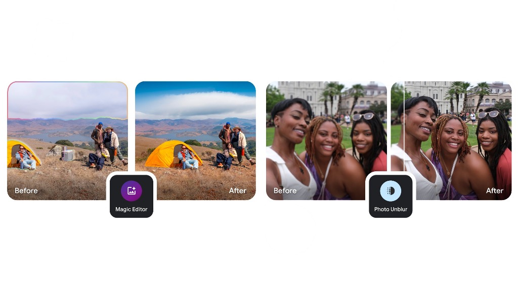
For many of us, our smartphones have become the primary keepers of our memories. We snap photos of everything – family gatherings, breathtaking landscapes, everyday moments that we want to hold onto. But as our photo libraries grow, managing them can become a daunting task.
Scrolling endlessly through a chaotic jumble of images isn’t exactly the nostalgic experience we’re hoping for. That’s where apps like Google Photos come in, offering tools to help us make sense of the digital deluge. And it seems Google is gearing up to give us even more control over our precious memories.
Google Photos has long been a favorite for its smart organization features. Its AI-powered capabilities, like facial recognition and automatic album creation, have made it easier than ever to find specific photos. One particularly useful feature is “Photo Stacking,” which automatically groups similar images, decluttering the main photo feed.3 Imagine taking a burst of photos of the same scene; Photo Stacking neatly bundles them, preventing your feed from becoming overwhelmed with near-identical shots.4 However, until now, this feature has been entirely automated, leaving users with little say in which photos are grouped. If the AI didn’t quite get it right, there wasn’t much you could do.
But whispers within the latest version of Google Photos suggest a significant change is on the horizon: manual photo stacking. This potential update promises to hand the reins over to the user, allowing us to curate our own photo stacks. What does this mean in practice? Imagine you have a series of photos from a family vacation. Some are posed group shots, others are candid moments, and a few are scenic landscapes from the same location. With manual stacking, you could choose precisely which photos belong together, creating custom collections that tell a more complete story.
This shift towards user control could be a game-changer for photo organization. Currently, if the automatic stacking feature misinterprets a set of photos, you’re stuck with the results. Perhaps the AI grouped photos from two slightly different events, or maybe it missed some subtle similarities between images you wanted to keep together. Manual stacking would eliminate these frustrations, allowing you to fine-tune your photo organization to your exact preferences.
While the exact implementation remains to be seen, we can speculate on how this feature might work. It’s likely that users will be able to select multiple photos from their main view and then choose a “Stack” option from the menu that appears at the bottom of the screen – the same menu that currently houses options like “Share,” “Favorite,” and “Trash.” This intuitive interface would make manual stacking a seamless part of the existing Google Photos workflow.
The implications of this potential update are significant. It’s not just about decluttering your photo feed; it’s about empowering users to tell their stories more effectively. By giving us the ability to manually group photos, Google is essentially providing us with a new level of creative control over our memories. We can create thematic collections, highlight specific moments, and curate our photo libraries in a way that truly reflects our personal experiences.
This move also speaks to a larger trend in user interface design: giving users more agency. Instead of relying solely on automated systems, developers are increasingly recognizing the importance of providing users with the tools to customize their experience. Manual photo stacking in Google Photos perfectly embodies this principle, putting the power of organization directly into the hands of the user.
While this feature is still in the development stages, its potential impact on how we manage and interact with our photos is undeniable. It promises to transform Google Photos from a simple photo storage app into a powerful storytelling tool, allowing us to connect with our memories in a more meaningful way. As we await further details and the official rollout of this feature, one thing is clear: the future of photo organization looks brighter than ever.
-
 Apps11 months ago
Gboard Proofread feature will support selected text
-

 News11 months ago
Samsung USA crafting One UI 6.1.1
-

 News10 months ago
Breaking: Samsung Galaxy S22 may get Galaxy AI features
-
 News10 months ago
Samsung Galaxy S23 Ultra with One UI 6.1 and all S24 AI features revealed
-

 News11 months ago
One UI 6.1 Auracast (Bluetooth LE Audio) feature coming to many Samsung phones
-

 News10 months ago
Satellite SOS feature coming to Google Pixel phones, evidence leaked
-
 Apps8 months ago
Google’s fancy new Weather app is finally available for more Android phones
-
 News11 months ago
Google Pixel evolves as Europe’s third best selling flagship


